There is something timeless about world map wall art, don’t you think? From the first decades until now, seeing world map art doesn’t get old. I’ve always wanted some neat art prints of art work with a globe or world map. I decided to create my own rather than buy one new because, well, I love to DIY of course.
But even if I don’t like to DIY, as long as you have a great world map stencil, anyone can do this. No joke, my kids could do this! Even if you aren’t a world traveler (Lord knows we surely aren’t), this can still be a great idea for a home office or a perfect gift for a new home! Anyone can purchase a world map poster, but wouldn’t it be cool to make your own antique world map?
World map art offers a timeless and versatile decor option that can complement various interior design styles, from modern to rustic. This is a perfect centerpiece for a gallery wall with world traveler pictures around it. There are endless room art ideas to go with it!

Before I dove into creating this world map artwork, I had a piece of inspiration to help guide me! Let me share with you my “inspiration” for this project.
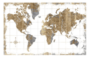
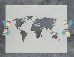
You can find the print above HERE- full disclosure, it’s over $150!
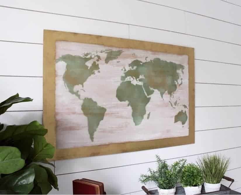
Isn’t it pretty? I love the gold antique accents and sense of wanderlust. It was an ideal choice for my living room wall, I just didn’t want to pay the high price tag. That only meant one thing; time to create my own!
Disclosure; this post contains affiliate links. As an Amazon Associate I earn from qualifying purchases. This does not affect the price you pay. This disclosure statement refers to the rest of the Amazon links in this post. See more on my disclosure page.
Materials for this aged world map
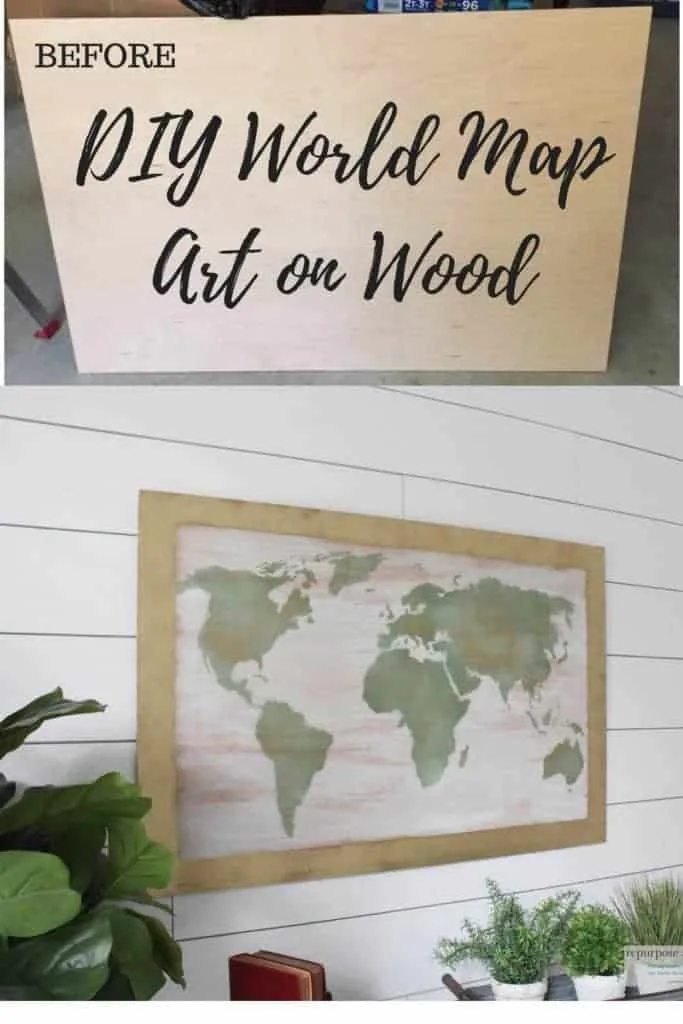
- wood or canvas of your choice. I used a piece of natural maple plywood (1/4 by 2′ by 4′)I purchased at our hardware store and I had them cut it to save time.
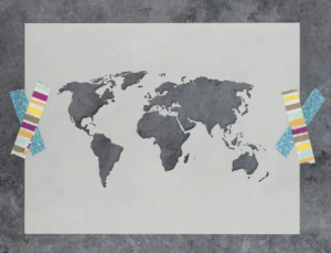
- world Map stencil. I used a stencil from a company called Stencil Revolution.
- Krylon sea glass and gold leaf spray paint. The sea glass spray paint is amazing! I love how it gives a soft greenish hue. The gold leaf spray paint is best too! In my opinion it’s the easiest way to add a little “gold leaf” without all the trouble of real gold leaf.
- painters tape
- paint pen to outline the border of the wood
- straight edge or ruler
- picture hanging hardware
Like I said, I purchased this natural maple board at the local hardware store. I did have them cut it to the dimensions to fit my world map stencil.
Speaking of world map stencil, check it out below.
Let’s get to making this fun piece of art!
How to create your own DIY world map art

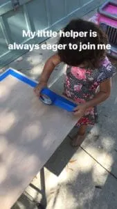
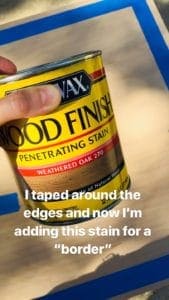
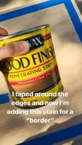
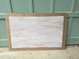
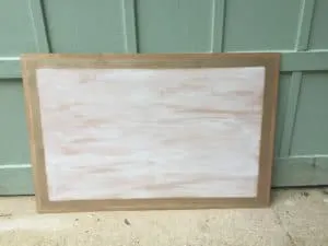
The first thing I did was add the painters tape around the edges to create a “border.”

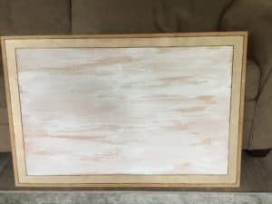
I used this stain to create a rustic finish around the wood.
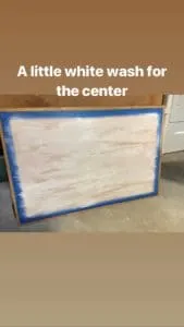
After I added the stain around the border of the world map art, I added a little white wash to the middle.
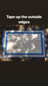

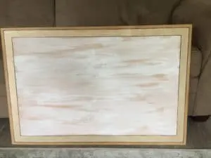
Next I needed to tape around the white wash and the border so I could add a little gold accent.
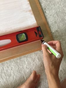

At this point I wasn’t real happy with the way the gold spray paint blended with the outside border weathered oak stain. I decided it might be best to use a paint pen and outline the borders.
I used a ruler and slowly started outlining around the gold spray paint with a black paint pen.
Here we are, with the outlined border, and I wasn’t happy with it.
Tell me I’m not the only one who starts a project with a fabulous vision of how it will turn out, only to realize the actual project isn’t anything that you envisioned or thought it would be.
Blah, back to the drawing board.
I almost didn’t share with y’all the “DIY fail border” above but then I thought, “this is part of the process.”
Honestly, about 40% of the time I start a project I have to “regroup” in the middle of it because I’m not happy with the direction it’s going. You can see an earlier post where I shared all about how I overcame a DIY fail and learned to fix it.
It’s all part of the creative DIY process right? That’s what I tell myself at least.
Learning and creating sometimes means making mistakes, and I like to make LOTS of them! LOL.

So where do I go from here?
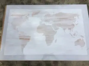
I decided to keep going with the stencil and come back to the border later.
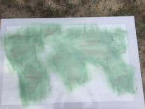
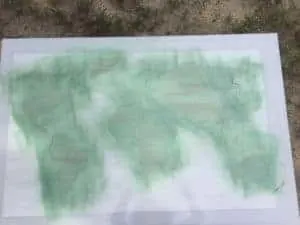
This is what it looked like after I sprayed the sea glass spray paint. I knew I wanted to add a little gold accent to the world map to tie the border colors in.

Like I said before, I LOVE this gold leaf spray paint. If you’ve ever used real gold leaf, you know it’s messy! This stuff doesn’t provide the texture that real gold leaf does, but it’s a very similar color and much easier to apply.
Speaking of gold on wood, check out this post where I shared more products of the best gold paint for wood.
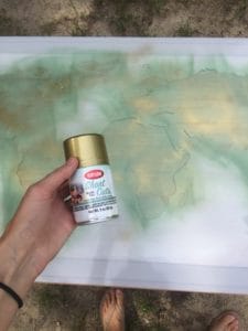
Ok it was time to revisit the DIY fail border. I decided to scratch the paint pen border and spray paint over the entire edge with the gold leaf spray paint.
I wanted my world map project to look like it all blended together and I figured the best way to do this was to add the same color gold leaf on the border as I did on the actual world map painting.
Now I can say my DIY world map painting is about complete.
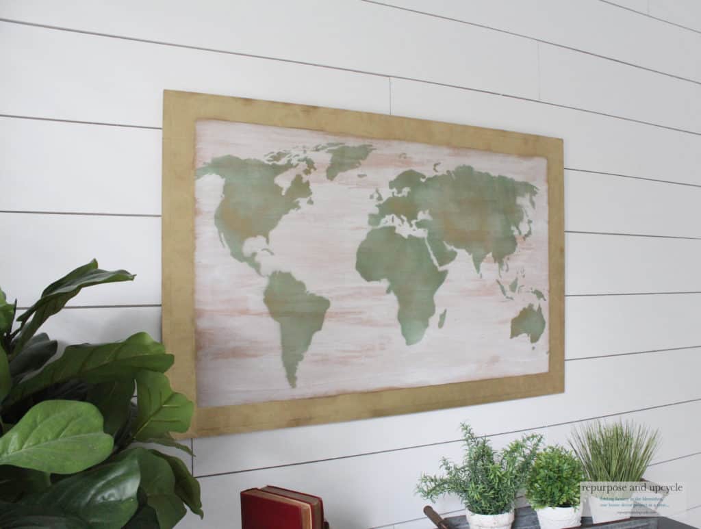

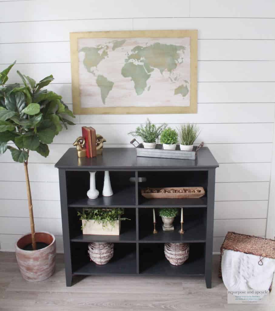
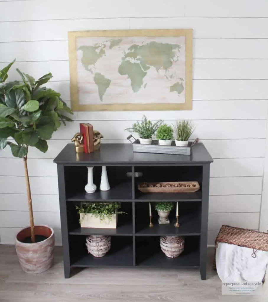
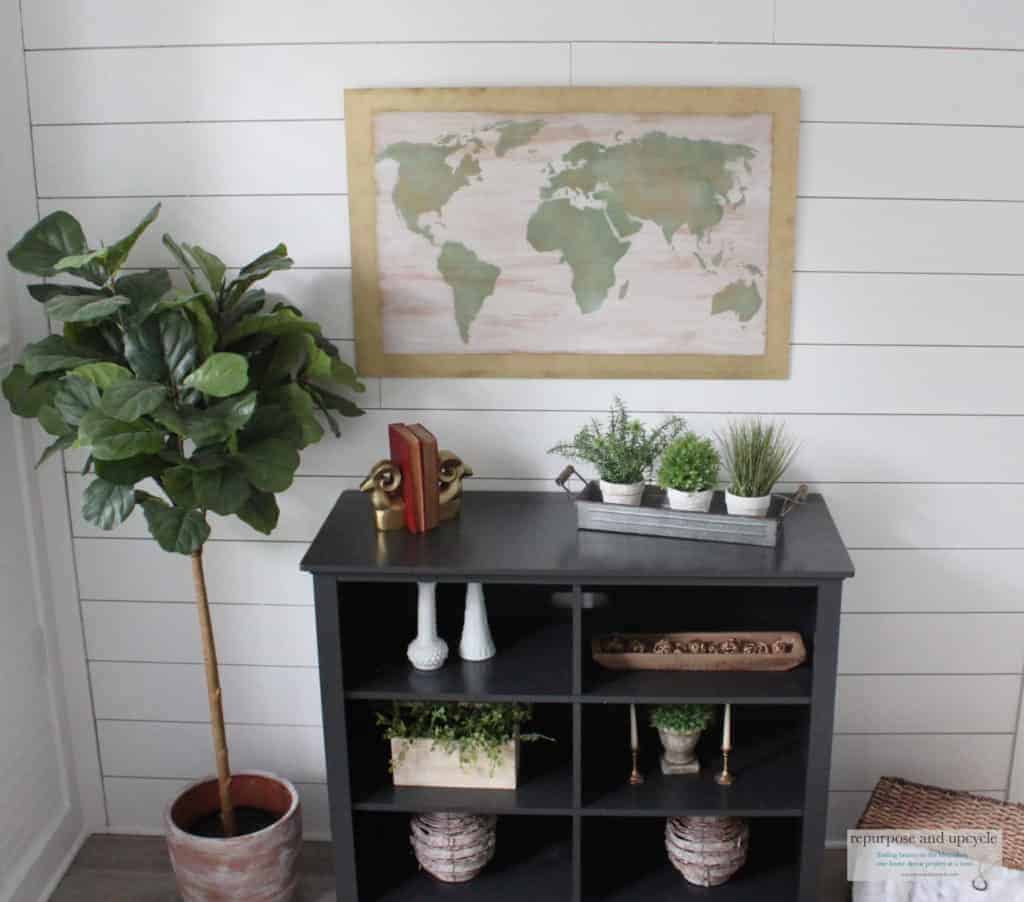

I’m going to be honest, I’m not 100% pleased with it. But for now I will leave it alone until I’m inspired to re create my world map art.

What do you think? Should I do something different to it? Time will tell….
Lindsey**
Hey,
Cool Stuff.
Absolutely fabulous. I love the color , the gold accent, everything! Featuring when my party opens up tonight.
What a great job you’ve done here! I think it looks wonderful; I’m not bothered by the lack of a frame. I do think adding the grid lines is a cool idea, and perhaps also the compass rose; maybe there’s a star stencil that would work for that? What a cool way to get a huge piece of art.
Thanks so much for joining the Grace at Home party at Imparting Grace. I’m featuring you this week!
[…] Repurpose and Upcycle: DIY World Map Art […]
[…] DIY World Map Art on Wood|Repurpose and Upcycle […]
I love this! You’re my favorite on Waste not Wednesday this week.
Thank you Deborah
[…] DIY World Map Art on Wood @ Repurpose And Upcycle […]
I like your wall art project. Like a few others said when you tire of it and have time if you aren’t happy with it you can fool around with it a bit more. I think there are always some projects we love, and other that don’t turn out quite the way we like. Yesterday I had to go over a part of a piece of furniture I was painting. I thought 2 colors until I saw it. Then ended up painting over it again when dry to make it one color again. There’s a lot of trial and error with being creative. I’m glad you didn’t give up 😉 Thanks for sharing at the Inspiration Spotlight party @DearCreatives See you again soon.
Thank you Theresa!
This is gorgeous! I can’t believe that’s not an actual wood frame around the piece! Totally had me fooled from the original photo. And I love that it’s so easy to put together. Thanks for sharing at Sweet Inspiration!
Thanks Amy!
[…] Wicker chairs Our Good Life — Easy Peach Mug Muffin Repurpose and Recycle — World Map Art on Wood Play Dates To Parties — Hostess Tips for When Your Guests have Severe Food […]
[…] DIY World Map on Wood via Repurpose and Upcycle […]
[…] DIY World Map on Wood via Repurpose and Upcycle […]
[…] DIY World Map on Wood via Repurpose and Upcycle […]
[…] DIY World Map on Wood via Repurpose and Upcycle […]
Relaxing and pretty at the same time. I love the map art!
[…] Repurpose & Upcycle shared this super cute DIY world map wall art. […]
[…] just loved this cute and creative DIY World Map Art by Repurpose and Upcycle! This adorable idea for a fall picnic from Taryn Whiteaker has us ready for the change of […]
[…] DIY World Map on Wood from Repurpose and Recycle […]
I love it! I wish I could hire you to make one jut like it for me!
awww, you can make it! I’m glad you like it.
[…] DIY World Map on Wood from Repurpose and Recycle […]
[…] DIY Tutorial: World Map Art. I love the rustic look of this DIY map tutorial. This would be great for a play […]
Really cute and it goes well with that space! #trafficjam
You really did a great job. I love how it turned out! Thanks for sharing with SYC.
hugs,
Jann
That looks pretty easy! I like it. I could see a transfer technique on the wood as well.
http://www.anapeladay.com/2018/08/ww-hummel-day-camp-linky.html
Nice work! Love the sea glass paint! Pinning this for later. Visiting from The Scoop at The Stone Gable.
Oh, I just luv this DIY. And this map is so beautiful! I’d luv to invite you to share this with us at Wall to Wall DIY Wednesday, which runs thru Mondays!
Thank you Ann! I will definitely hop on over and share at your party. Thanks for stopping by.
I like it as is! I love old maps also. I recently saw a globe as a lamp and would have bought it immediately but couldn’t think of a spot to plug it in!
A friend recently gave me a map that you scratch off the places you’ve been. I haven’t done it yet, you’ve inspired me!!!
https://www.amazon.ca/Scratch-World-scratch-detailed-cartography/dp/B00O8PNW6M
what a cool idea! Thanks for stopping by.
I’m with the majority…needs a real frame. Not crazy about white wash. An antique solid white seems better to me if you’re going for a white background. Plus…this might seem nit picky, but something about the stencil itself? The map looks weird to me. Especially Greenland. Maybe take the edge of frame and butt it up to where Greenland starts. The frame, to me, needs to be closer to whole map stencil. but I loved you sharing this, fails and all and then opened yourself up to everyone ‘s opinion. Do what makes your eyes happy.
Thank you Dannie! Yes, it definitely needs a frame. And the map isn’t perfect. I have learned a lot from this and I might just scratch it and start a new one!
That’s so clever. I love it, it’s so stylish! xx
I have been where you are when a project doesn’t go quite right. I like the other commenter’s idea about adding the grid lines. The frame on the original doesn’t have straight lines so maybe make the frame more free form? But I do like the concept and I know you will figure out what to do to make it more to your liking.
Thank you Joy! That’s a great idea. I thought about adding a dark wood frame around it, but aging the gold part might just be my best option!
You asked for input, so here goes:
1. I agree with Peggy – the whitewash background color does not work as it is almost the same color as your wall, also the obvious woodgrain is too large and distracts the eye from the map element. I think painting the background a more opaque ivory color, lightly antiqued with a brown glaze around the edges next to the border area (that should be covered with a frame – see next comment) would work better. Then the surface can be lightly “flyspecked” with that color and also with a lighter brown. Use a tooth brush flicked with your finger. Watered down acrylic paint can be used for this. You will be going for an old, distressed parchment look.
2. The edges (where the border is now) should be covered with a Farmhouse look flat frame (top and bottom pieces the full width of the plywood with the verticals cut to fit in between them – much like framing a large, on the wall bath mirror. This can be dressed up by putting lattice strips around the edges (perpendicular) to these pieces, this time with the verticals the length of the sides and the top and bottom fitting in between. It should extend past the front of the frame 1/4″to 3/8″ with any excess to the back. Attach all these frame pieces with brads and some glue. Small strips glued to this lattice and to the back of the picture panel will secure everything together. This lattice strip will cover any raw edges and give a finished look (all these pieces finished in the same color) – if you like the gold metallic as an accent it could be done on the front edge of the lattice strip (Rub & Buff works well for this or you could mask off the sides, inner edge and picture and use your gold spray).
3. For the land masses, you could base coat them with your sea glass color spray and then do a very LIGHT misting of the gold (do this from very high above to gently fall on the areas) and then to give them more interest (similar to the original print), I would lightly sponge over them with several other shades (lighter and darker) that would co-ordinate with the sea glass color. Other colors could also be lightly sponged over as well. Use the small, natural artists’ sea sponges for this. You could use water colors or acrylics for this. Use a very light touch with minimal paint. If you use acrylics for this, rinse the sponges IMMEDIATELY in soapy water to remove all paint (dried acrylic paint will ruin them). You could also “flyspeck” as you did the background.
4. A good way to check out if objects, shapes and color values are working in a picture is to “fuzz your eyes” – i.e. half close your eyes and look through your lashes. Detail are lost and you can see where values need to be strengthened. You may want to lighten or darken areas, use some detailing, outlining, etc.
Hope some of this helps. I do like the map idea and the size is perfect for where you are using it. Certainly agree with you that spending over $150 for print is a little over the top – besides it so much more fun doing something yourself. I look forward to your next projects. All the best!
Wow thank you Jill, those are some fabulous ideas! I am ultimately thinking I will add a “farmhouse frame” like you suggested. It needs to be “framed” and I think my faux frame just isn’t working well with the map. Since this didn’t cost me much to create, I might just scratch it and create a whole new one! Thank you again for your input, I love hearing others opinions.
I like the concept but for some reason the stencil area looks blurry to me. I’m not sure why, but I don’t think that was your intent. The whitewash background is distracting from the continent shapes, I think. I’m not sure how to remedy that except to choose a different material for the background. I do like the green color you used for the continents, but the gold on top of the green looks really random to me. I, personally, liked the boarder definition that your first try with the gold paint and the paint pen gave the piece. It defined the art (stencil) work better than what you ended up with. But, these statements are only my perceptions and opinions. Take what is useful to you and leave the rest–I won’t be offended! One last idea I tho’t of: Instead of the whitewashed background what do you think of using a light grey-blue color for the background and make it a solid color rather than the whitewash style? A kind of “ocean” look. Then a little darker navy blue for the edges outlined with a gold paint pen. I don’t know if any of this is appealing to you but I just keep thinking of ideas! Okay, I’ll stop now! Will be interested to see what you do if you re-do the map at some point.
Hi Naomi,
What a fantastic idea about the blue for the background. I thought about that originally but I worried it might look too busy with the green and gold. I do think the white wash isn’t working with this piece. I’m thinking I might scratch this one and start new! We shall see. Thanks again for your input.
I like it the way it is! When you get tired of it you can always give it a light sanding and paint the entire thing again with your next theme. I just started again with a canvas I had already crafted and was tired. Spray paint and begin again.
But pause and think about the map cause it could grow on you!
Thank you! I am thinking of holding onto this one and starting a new one!
Personally I love the whitewash but not the gold border. Something bugs me about the edges not being trimmed out so I would probably frame it out with molding and paint it black and then add the gold and distress it to show the black under it in spots. But I really love the map idea! Especially if you have a huge, empty wall…….like I currently do. I’ve been in my new home exactly a week lol. This looks like something I may try tho!!
Hi Tina,
congrats on your new home! I do think I need a formal frame, and I’m not digging the gold either. After I frame it, I will re evaluate the picture and see if I need to do anything else. Thank you so much for the input!
A really good idea, but I don’t think whitewash is the best background color. It’s very blah. That being said, I’m not sure what color would be better. Possibly a darker, more earthy tone, and a brighter green for the map?
That’s a good idea! Thanks for the input.